In many AI-driven SOC platforms, you open an alert and instead of a clear signal, you’re met with a wall of text: nested details, vendor data, and AI summaries all competing for your attention and hard to quickly make sense of.
We’ve been focused on solving this problem with one priority in mind: the end user. After years of learning from customers, Radiant is rolling out a full redesign of alerts.
Why now?
When AI capabilities began making their way into SOC tooling, the intent across the industry was clear: reduce the time analysts spend on repetitive triage tasks and surface real threats faster. The reality of what got built, however, often told a different story.
Introducing AI into existing alert structures meant more content on the page. With access to everything an AI Agent has been trained to research and produce, the natural instinct was to surface all of it. Why filter when you can provide? A philosophy of “if we have it, they should see it” became a common approach. A philosophy that looked impressive in demos but quietly worked against the SOC analysts. More text, more scrolling, more context, and ironically, more analyzing to understand how AI arrived at the suggested next steps.
For analysts juggling a queue of alerts and working to separate real threats from noise, that experience introduced a new kind of friction. Instead of reducing cognitive load, these implementations increased it. Instead of accelerating triage, they were slowing it down. The AI was generating findings, but the design was burying them.
Another assumption took hold across the space as well: that analysts needed to see everything upfront in order to trust the AI’s output. So more information got surfaced at the first level of the alert. But more information meant more time spent on the page, more pivoting between tools, and more mental overhead spent trying to validate a recommendation rather than acting on it.
The result was a disjointed experience that forced analysts to piece together their own investigation, ultimately defeating the entire purpose of having AI in the loop at all.
Our process
One of the most important decisions we made early in this redesign was to deliberately set aside our existing structure. While we could have iterated on what we already had, we needed to ask whether what’s already there is actually serving the user at all.
To kick things off, our design and product teams came together to workshop a deceptively simple question: What is the critical information an analyst needs when they go to triage an alert?
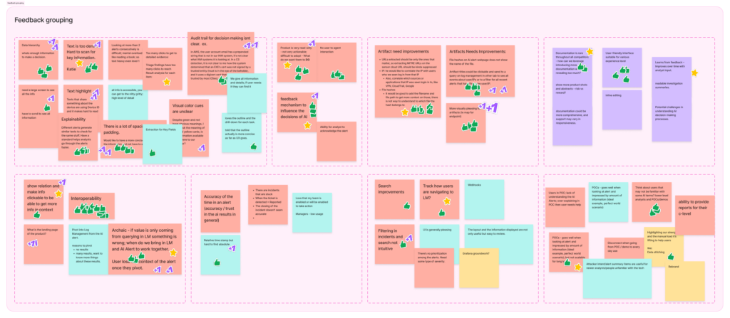
To pressure-test our assumptions, we looked inside and outside of Radiant’s walls. We scanned Reddit threads, listened to podcasts, and read product reviews to understand what the broader community was saying about AI tools. We reviewed feedback from existing customers and internal users. We then grouped those inputs into categories, prioritized them, and let factual frustrations inform our direction.
Quick look into our organized chaos of categorized feedback
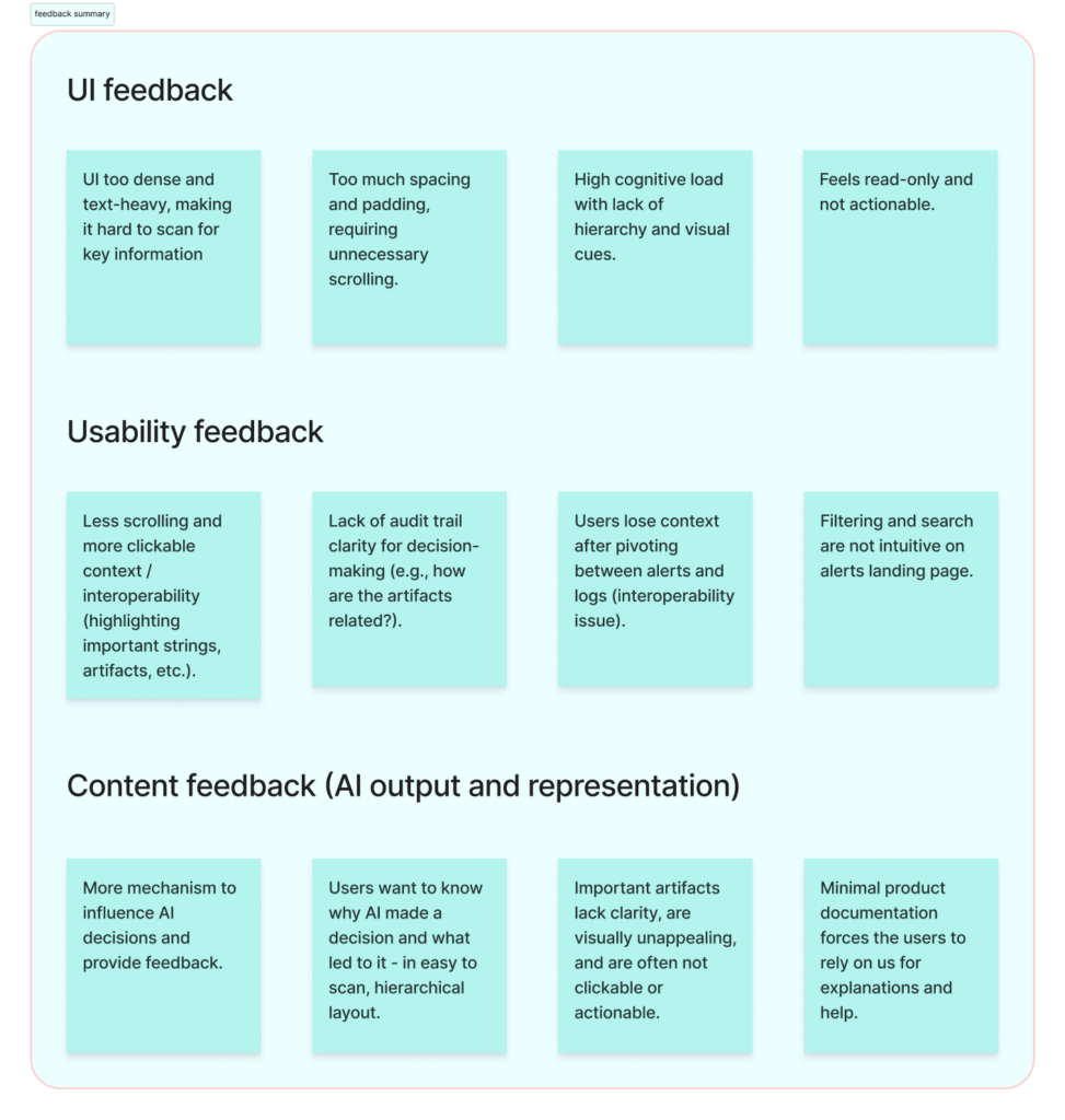
Clean summary of feedback groupings
From there, we did a thorough audit of all the information available per alert (everything coming in from vendors, everything our AI agent produces) and we forced ourselves to categorize it by importance.
Grouping the alert details per level
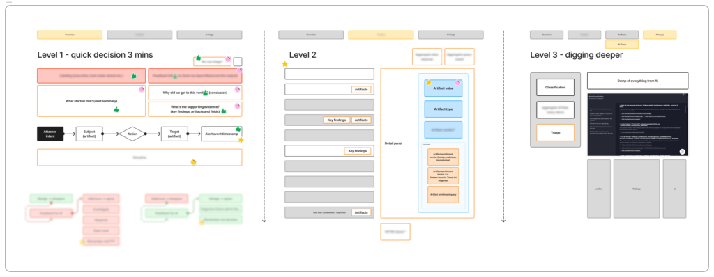
A couple key findings shaped everything that came after:
-
- Analysts don’t need every piece of information to decide whether they agree with the AI’s verdict. They just need is the right information, presented in a way that supports fast, confident decision-making. The deeper detail still matters, but it should be available when the analyst wants it, not dumped on them before they’ve even oriented themselves.
-
- Trust in AI doesn’t come from volume, it comes from transparency. Showing an analyst a paragraph of AI-generated text and asking them to take it at face value creates skepticism. Showing them a clear finding with a source annotation proving where each piece of information came from (Radiant triage, the vendor, org-specific details, inferred model knowledge, threat intel, etc.) keeps them in the flow and gives them a handle on where to dig deeper.
With those findings in hand, we built prototypes in Figma, brought them to users, listened, adjusted, and validated.
The outcome: highlights of the redesign
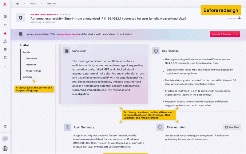
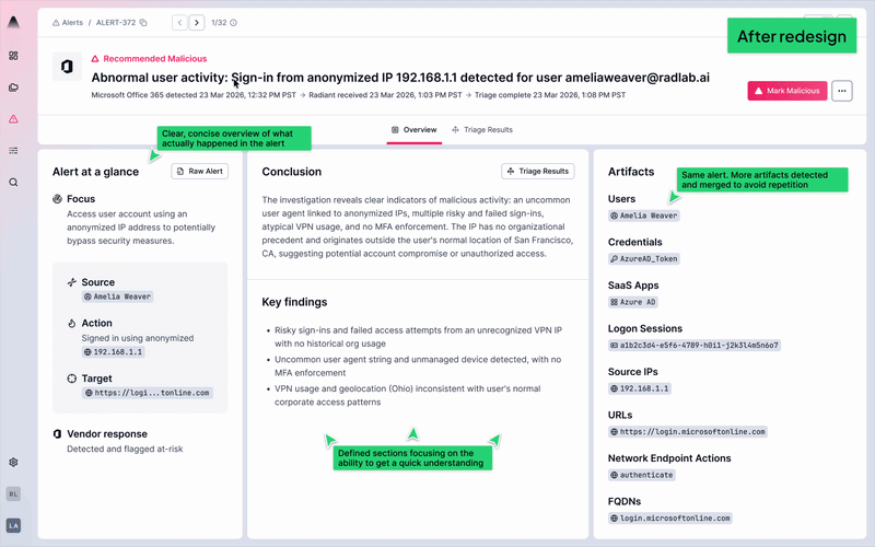
1. A structure built for scanning
The new layout introduces a tabbed structure that separates the alert into distinct, purposeful layers. The Overview tab is designed to be scanned, built for L1 analysts who need to orient quickly, assess the AI’s verdict, and keep moving. For L2 and L3 analysts who want to dig deeper, the Triage Results tab is one click away. The hierarchy is intentional: the right information for the right analyst, with deeper analysis always within reach when the investigation calls for it.
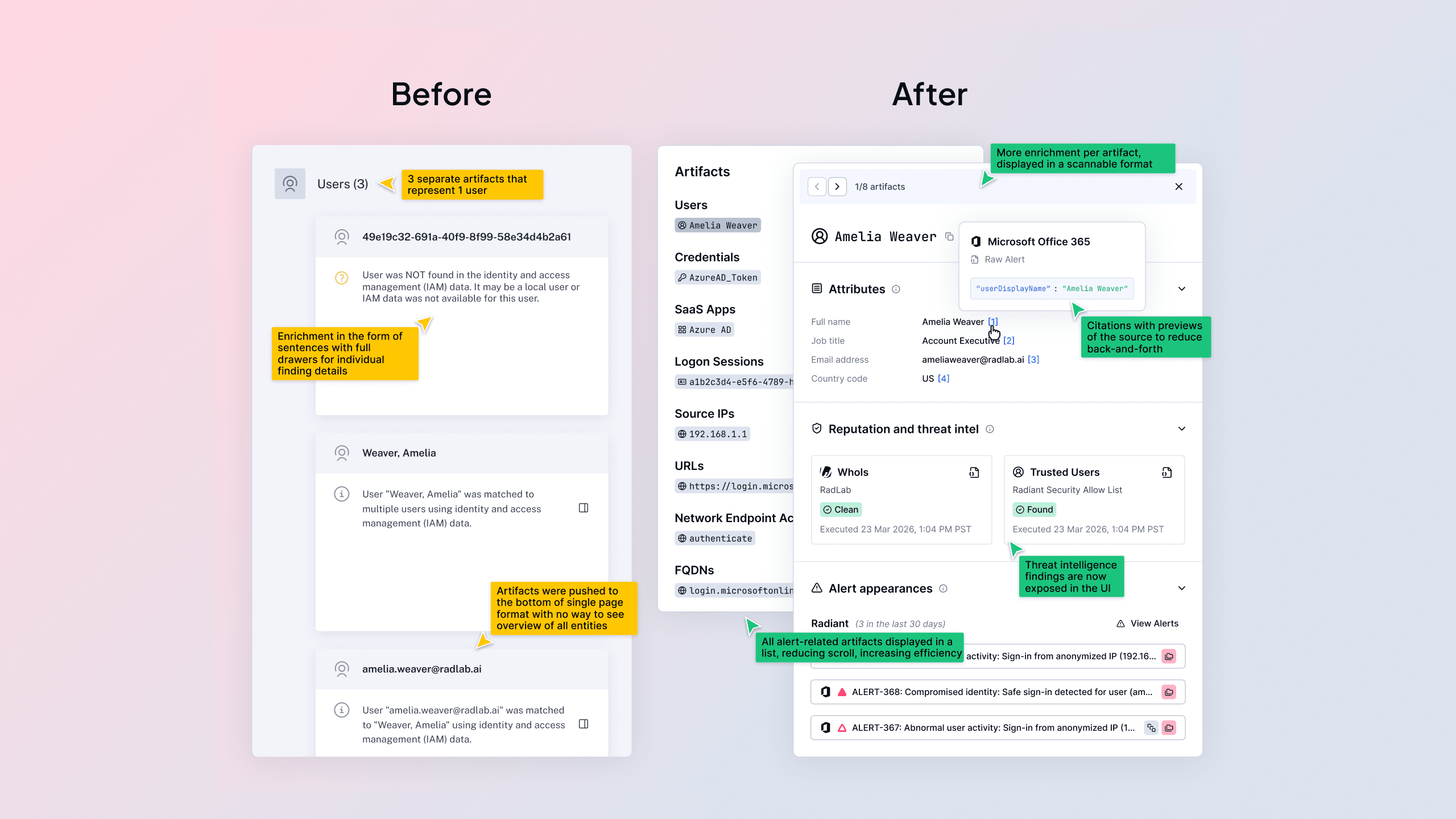
Before redesign
After redesign
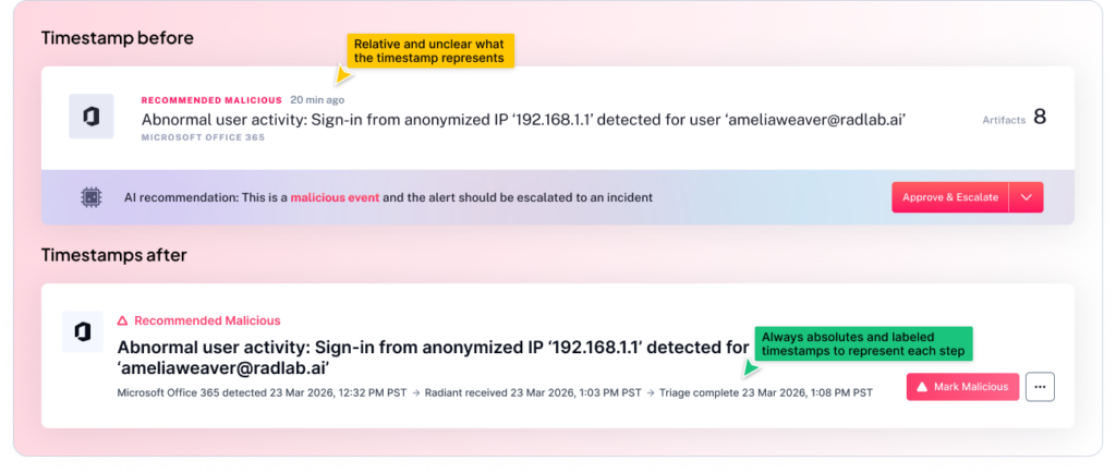
2. Three explicit timestamps for timeline clarity
One of the small but meaningful additions is the explicit exposure of three timestamps: when the vendor detected the alert, when Radiant received it, and when triage was completed. This might sound like a minor detail, but for an analyst building a timeline or drafting an incident report, knowing exactly when each handoff occurred is the difference between confidence and guesswork. The chain of events is now visible at a glance, providing a clearer picture of mean time to triage.
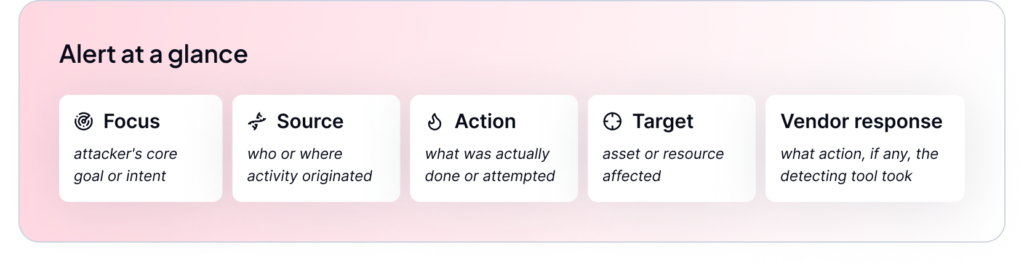
3. Alert at a glance: Consistent, vendor-direct facts
Every alert now includes the same standardized, five-point summary pulling facts directly from the vendor: Focus, Source, Action, Target, Vendor Response. This consistency means analysts build pattern recognition over time and reduces the time spent figuring out where to look when you open a new alert.
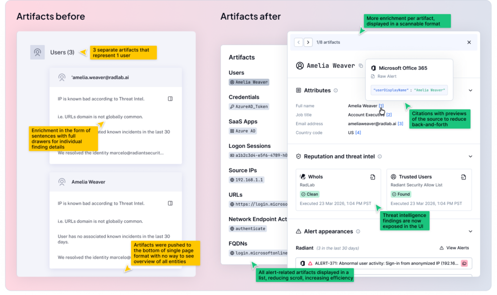
4. Interactive artifact tags with consistent enrichment
Artifacts (the people, devices, network objects, and other security-relevant items that appear in security alerts) are no longer buried in text. They are now visually represented as interactive tags, and they carry consistent enrichment whether you encounter them inside an alert or inside a case. This matters because context-switching is one of the biggest time drains in a SOC workflow. When an analyst sees an artifact, they can interact with it inline rather than pivoting to another tool, copying and pasting, and losing their place in the investigation.
What this means for our users
The guiding principle of everything we built is this: the analyst’s judgment is the most valuable thing in the loop. AI should handle the heavy lifting of aggregation and initial analysis so that the analyst can focus on what they actually do best: reasoning, validating, and deciding.
Analysts aren’t looking for the AI to make the final decision. They’re looking for AI to do the prep work clearly enough that the decision is obvious. That means hierarchy, transparency, and not making them read three paragraphs before they understand what they’re looking at.
What’s next
This release of the alert redesign is only our first phase. We have more work ahead as we continue to learn how analysts are moving through the new experience, what’s still creating friction, and where we can push further. To call out a few specific features we’re already working on and will release shortly after this:
-
- Deeper enrichment including bring your own threat intelligence feeds.
-
- Expanding human-in-the-loop capabilities to keep experts in control.
-
- Clearer organization of findings coming from Radiant’s triage agents.
We’ll be sharing more updates as we build, and as always, the feedback we hear from the people using this product every day is what drives us forward. A huge thank you to all of the users we have spoken to, both internal and external, to help us take this big step toward the next phase of Radiant.